FocusMate reminders & to-do lists
FocusMate is a conceptual productivity & reminder app and responsive website targeted to users with ADHD. As someone who was diagnosed with ADHD as an adult, I’ve tried countless productivity systems and tools over the years and have found that there is a lack of apps on the market that effectively address the needs of users with ADHD.
Many adults with ADHD, particularly women, have had to develop their own organization systems to stay on top of work tasks, personal projects, and daily reminders like taking their medication. I wanted to create a product that would simplify and consolidate those systems into one app that considers these users’ unique needs.
What
Mobile app & responsive website portfolio project
Role
UX designer from conception to delivery
Tool
Figma
Timeline
Dec 2022 - Jan 2023
Responsibilities
User research
Paper & digital wireframing
Low- & high-fidelity prototyping
Accounting for accessibility
Iterating on designs
Case study sections:
Market research
Personas
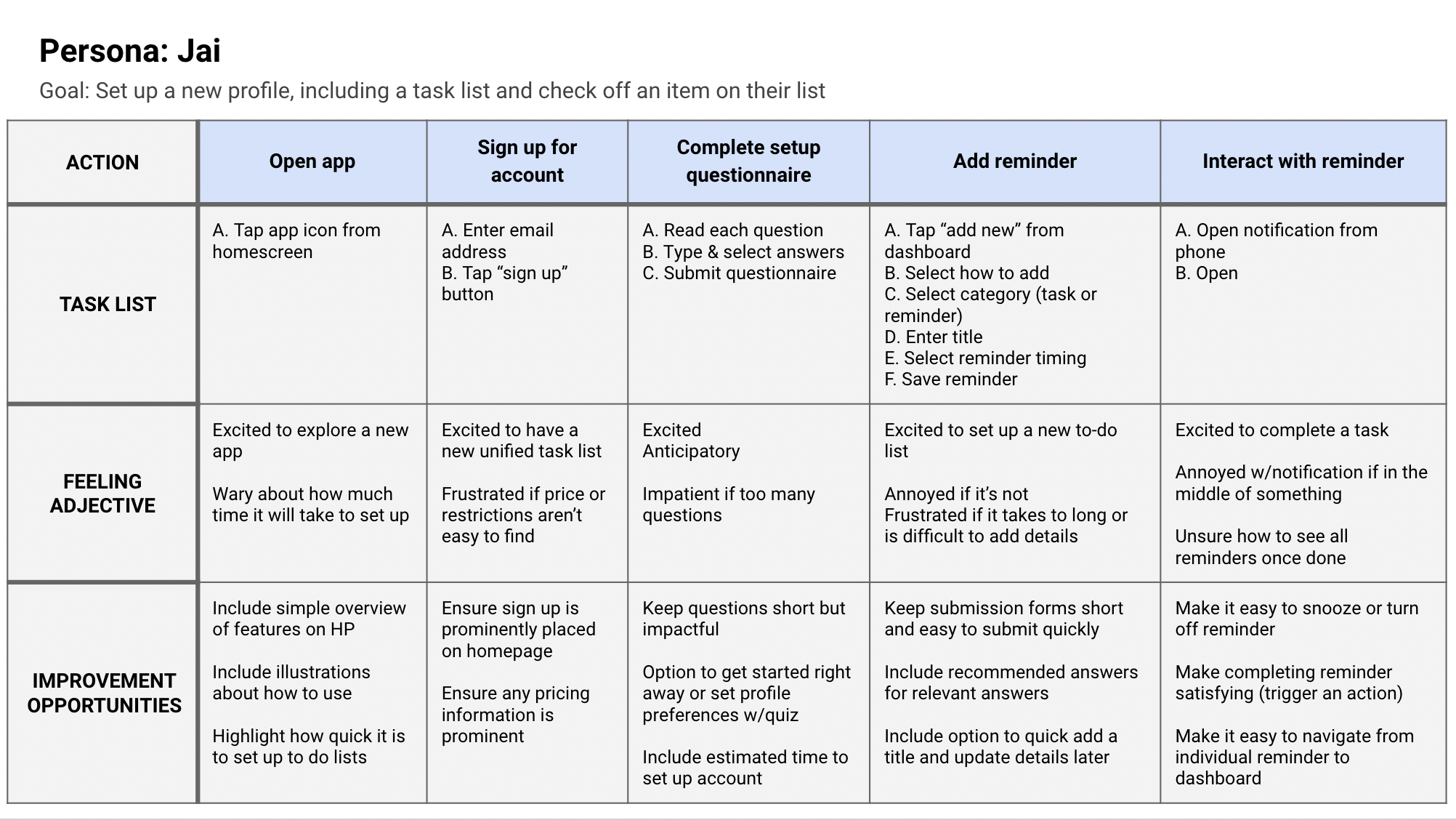
User journey maps
Wireframes
Case Study
High-fidelity UI
Prototype
Accessibility evaluation
Responsive site design
Learnings & next steps
The user problem
Users with ADHD struggle with time management and working memory—leading to forgetfulness when tasks or notes are “out of sight.”
The goal
Create a flexible and adaptable reminder and to-do list product that supports executive function, time management, and object constancy* for users with ADHD.
Key product priorities:
Easier ways to add reminders and tasks whenever they come up
Smart notifications that adapt to users’ preferences
Task prioritization (a centralized inbox and easy organization)
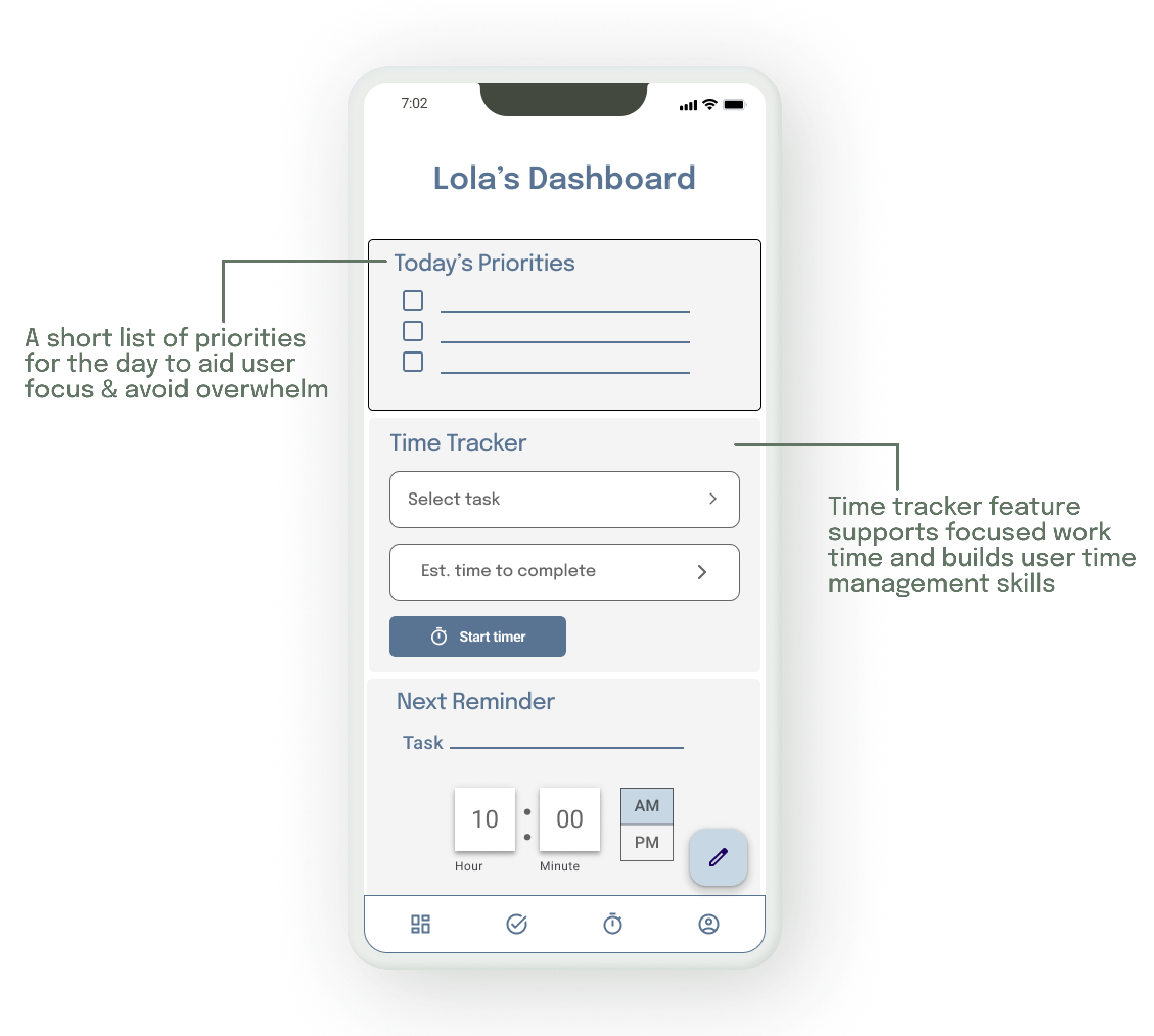
Time tracking to help build realistic routines
Quick and easy setup and maintenance to help users stick with the app
A simple user interface to focus on just the most critical tasks — avoid procrastination with over organizing
*Object constancy is the ability to maintain a positive emotional bond with something even when distance and conflicts intrude. Those with ADHD often experience “out of sight, out of mind” related to tasks, organization, and relationships.

Market validation
Creating products with neurodivergent users in mind is a personal passion of mine, but it’s also an increasingly important part of any UX strategy. Diagnosis rates have risen over the past two decades thanks to greater awareness and understanding of symptoms, particularly for women. Additionally, more and more users do not qualify for an official ADHD diagnosis but would benefit from many of the same features.
The data
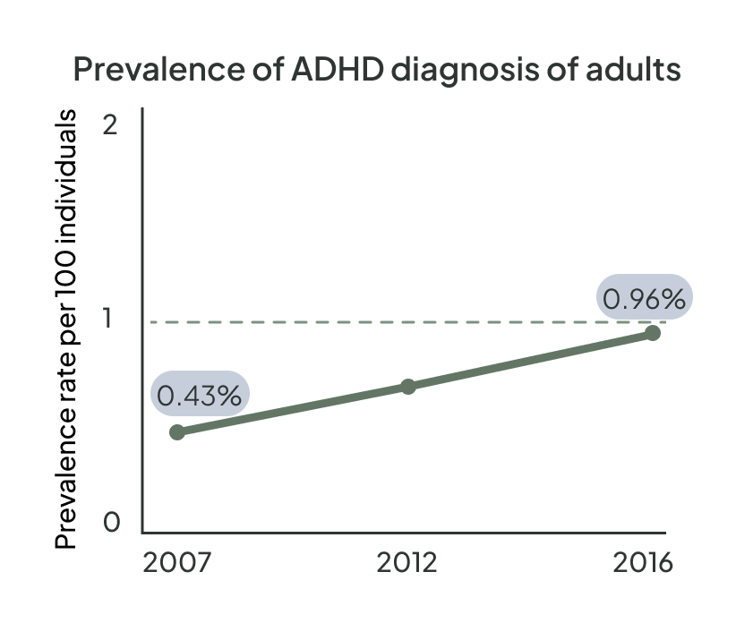
The prevalence of US adults with ADHD increased by 123% from 2007 to 2016, and early research indicates the diagnosis rate has risen since 2020.
Understanding the user
User Pain Points
I began the design process with user research, conducting interviews, and creating empathy maps to understand the users I’m designing for and their needs. Although I identify strongly with the target user for FocusMate, it was important to get feedback from a wider range of users. Within the primary user group of adults with ADHD, I identified sub-groups of busy stay-at-home moms and working professionals.
Both user groups validated a focus on making new tasks and reminders easy to add, but research also supported creating task time trackers, a feature often behind a paywall in other task management apps. There is also an opportunity to tailor notifications to the needs and preferences of each user to improve follow-through and user lifespan.
1
Disjointed tools
Users who rely on multiple systems or tools to organize their tasks and to-do lists (lists in notebooks, post-it notes, digital task lists) need a single unified tool to consolidate.
2
Reminders
Project management tools often don’t include flexible reminders to help users prioritize their time.
3
Time management
Users with ADHD struggle with time management and need support to keep them focused on their most important tasks.
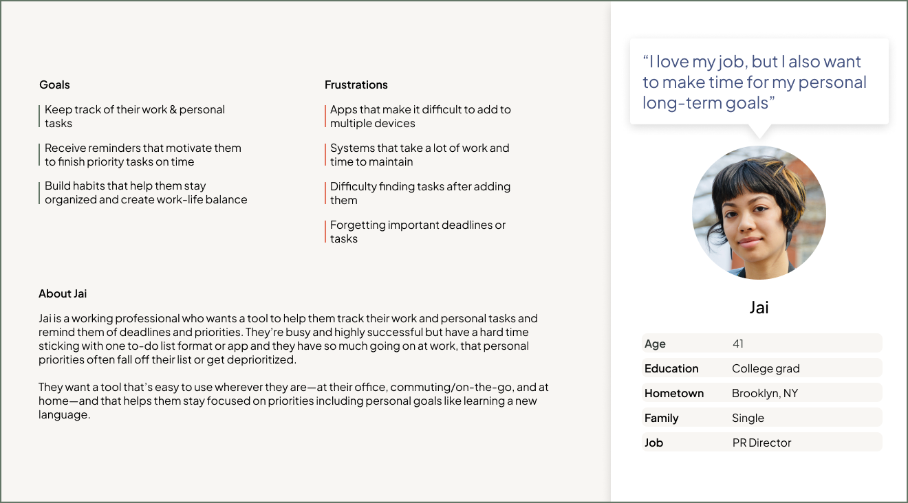
The personas Penny & Jai represent our primary user groups, busy moms and working professionals
Problem statement:
Penny is a stay-at-home mom & freelancer who needs regular reminders to maintain healthy habits because she can easily get overwhelmed by her busy schedule.
Problem statement:
Jai is a working professional who needs a to-do list that combines their professional & personal tasks because they struggle to prioritize long-term goals while also hitting day-to-day deadlines.
User journey maps:
User journey maps for our primary user groups reinforced the need for efficient but informative onboarding and the ability to quickly add a new task or reminder.
Early designs
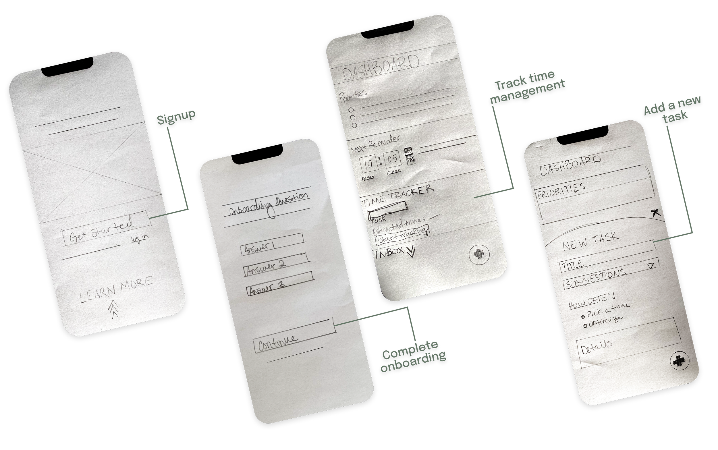
Paper wireframes
Once I better understood the user and their pain points, I began brainstorming and sketching paper wireframes.
I knew I wanted to create an onboarding to help users get the most out of the app features in a lightweight way that wouldn’t require them to spend much time on setup. The dashboard where returning users manage their current tasks and add new ones was also crucial for me to get right, so I sketched several variations.
Digital wireframes
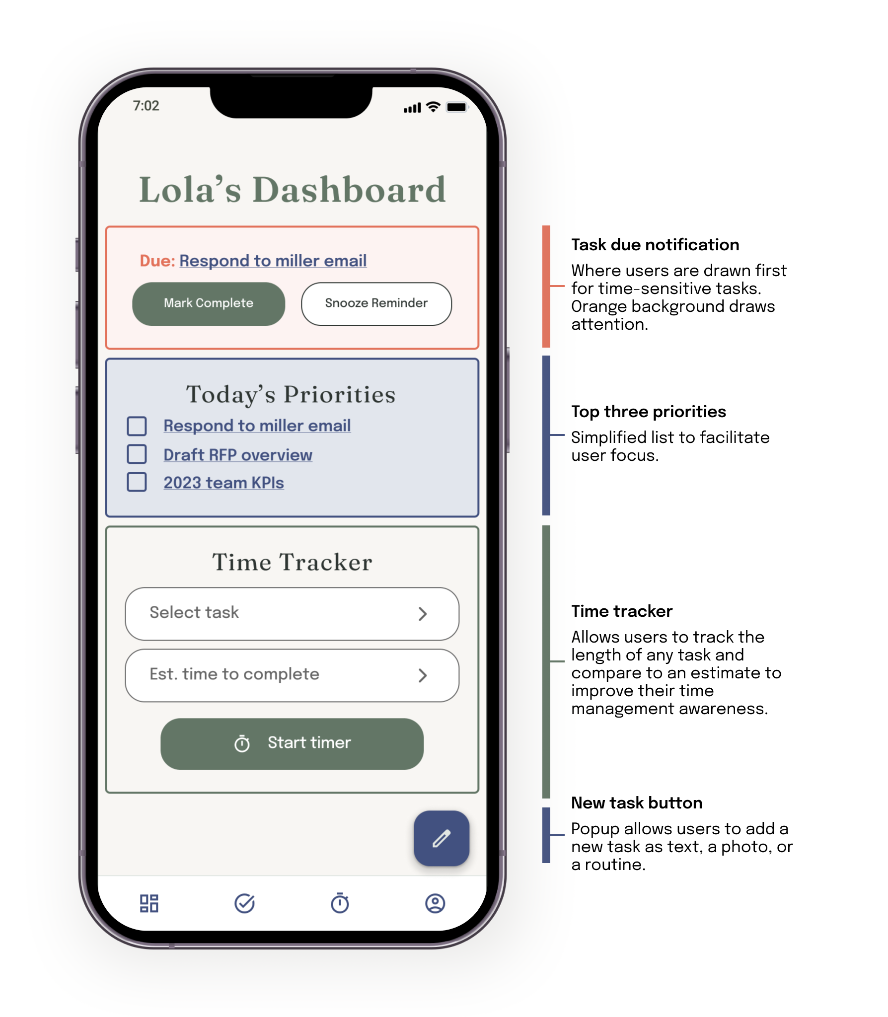
My goal for digital wireframes was to highlight the features that support user focus, help build time management skills, & place reminders front and center.
Low-fidelity prototype
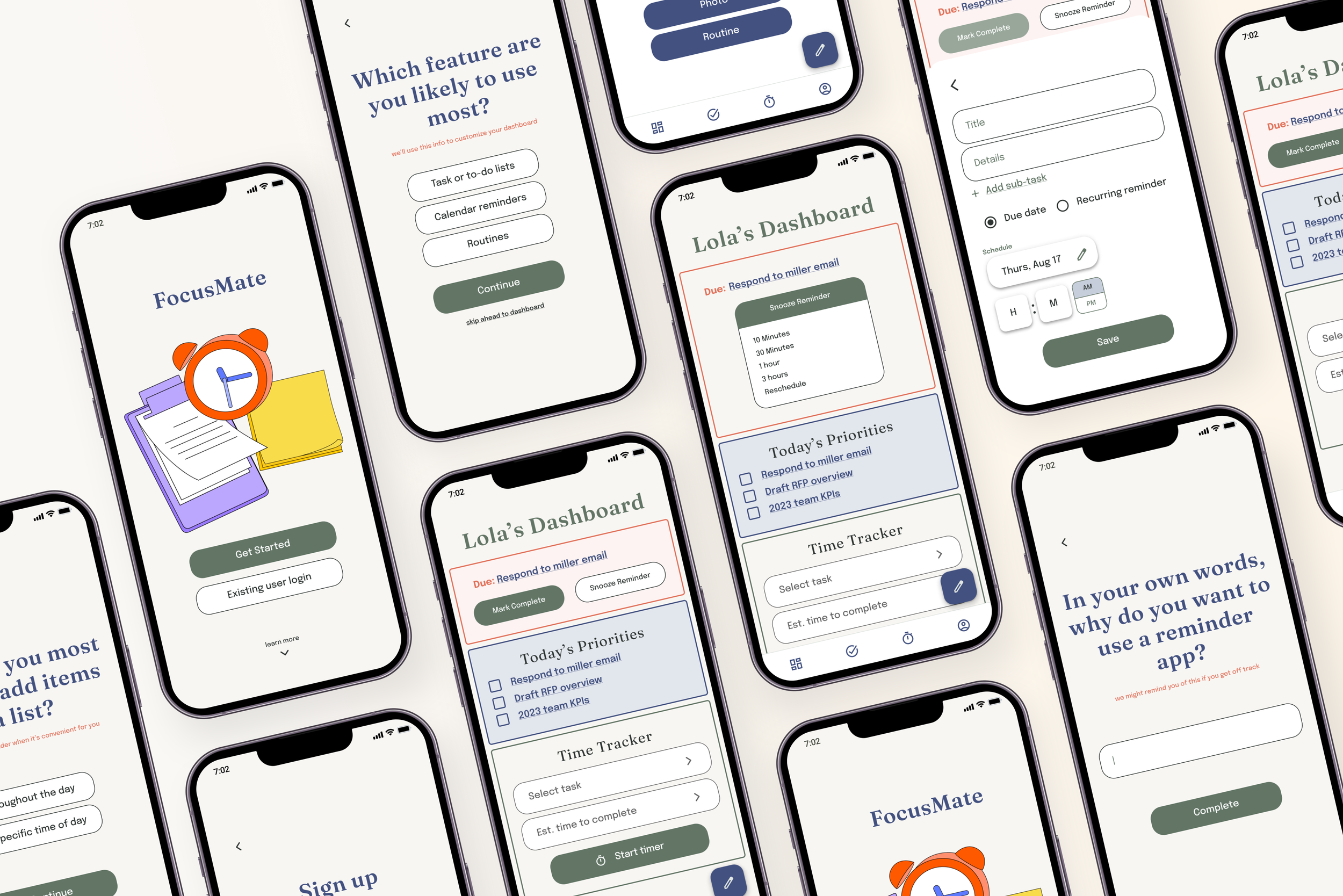
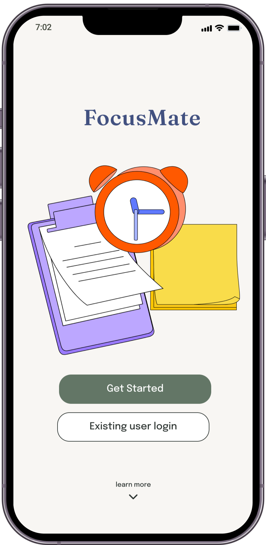
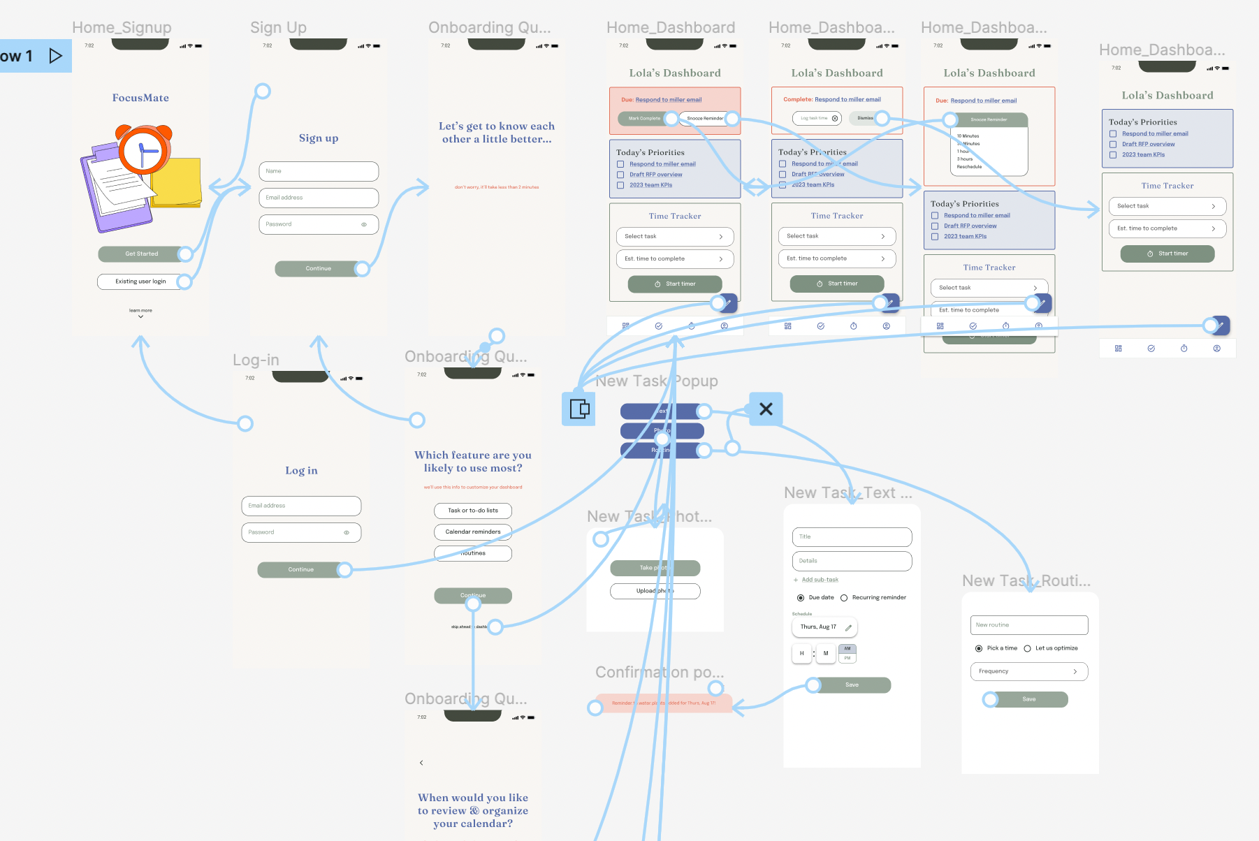
For the low-fidelity prototype, I created a signup & onboarding flow to highlight the app’s unique focus on personalized reminders. Once users complete signup, they are taken to their dashboard, where they can see their top priorities, add a new task to their to-do list, or track time spent on an existing task.
You can view the low-fidelity prototype here.
Refining the design
Usability studies
Before transitioning from low-fidelity wireframes to high-fidelity mockups, I conducted a usability study. The study goal was to identify how easy it is for users to complete the onboarding process and add a new task to their to-do list.
Methodology: Moderated usability study. Participants tested the low-fidelity prototype of the FocusMate App.
Participants: 5 users; 1 male & 4 females
The usability study revealed opportunities for us to provide more education about features up front, additional requested features, & the need to clarify language.
Learnings
-

Onboarding
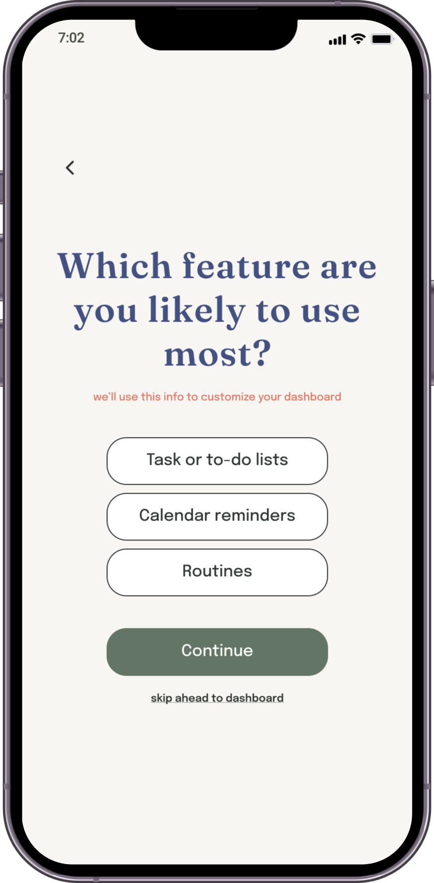
Users expressed confusion about the purpose of the onboarding questions, and were unsure what features to expect. This indicated an opportunity to add more context about features to the onboarding.
-

Defining task vs reminder
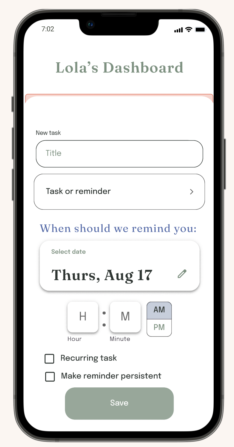
Users were confused by the distinction between a “task” and a “reminder” and what a “persistent reminder” was. I saw a need to use clearer language and reassessed how different types of tasks are differentiated in the app.
-

Task data
Users suggested additional task data they’d like the option to capture including subtasks, a description/details, & recurring task scheduling.
Adding ‘tasks’
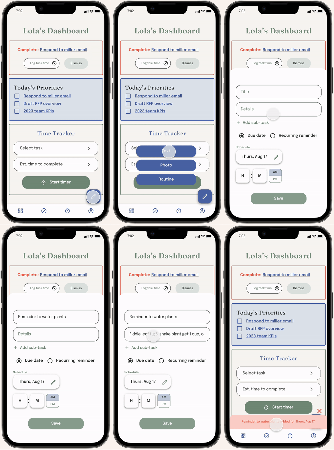
The usability study highlighted strong potential for improvement to the “add a new task” overlay. To address users’ feedback, I added in requested features like a “description” text field and the ability to add subtasks, removed confusing or superfluous elements like the “task or reminder” dropdown, and resized elements to consolidate space.
Before usability studyAfter usability studyMockup Visuals
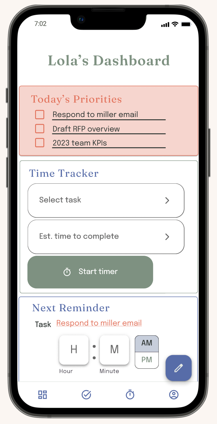
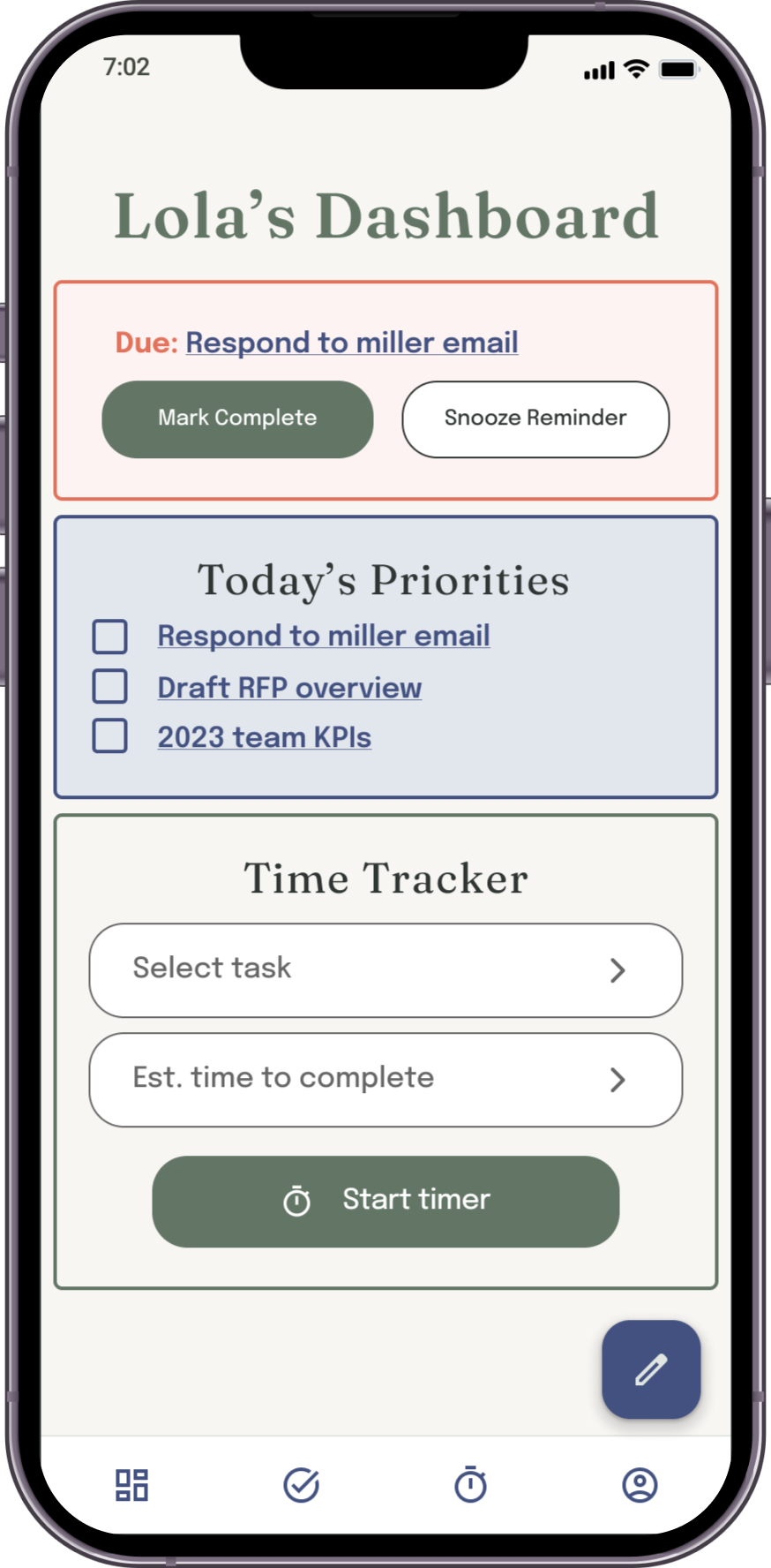
I made several visual design changes between mockups v1 and v2, including shifting the background color from stark white to a more soothing neutral shade and making all buttons smaller to allow for a less cluttered interface.
I also re-arranged the Dashboard elements to bring the currently due notification to the most prominent place up top.
Before usability studyAfter usability studyVisual UI Overview
I keenly felt the importance of creating a functional & appealing UI for users with ADHD.
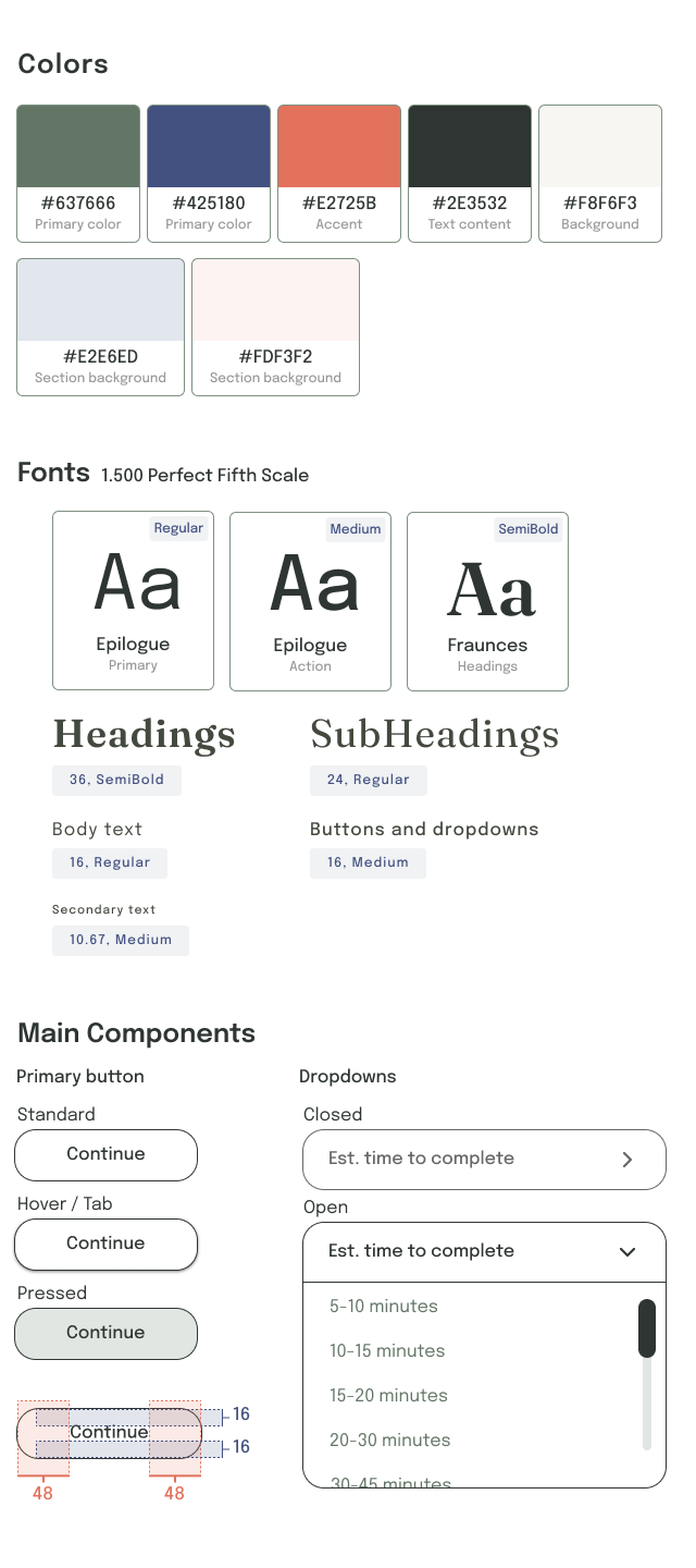
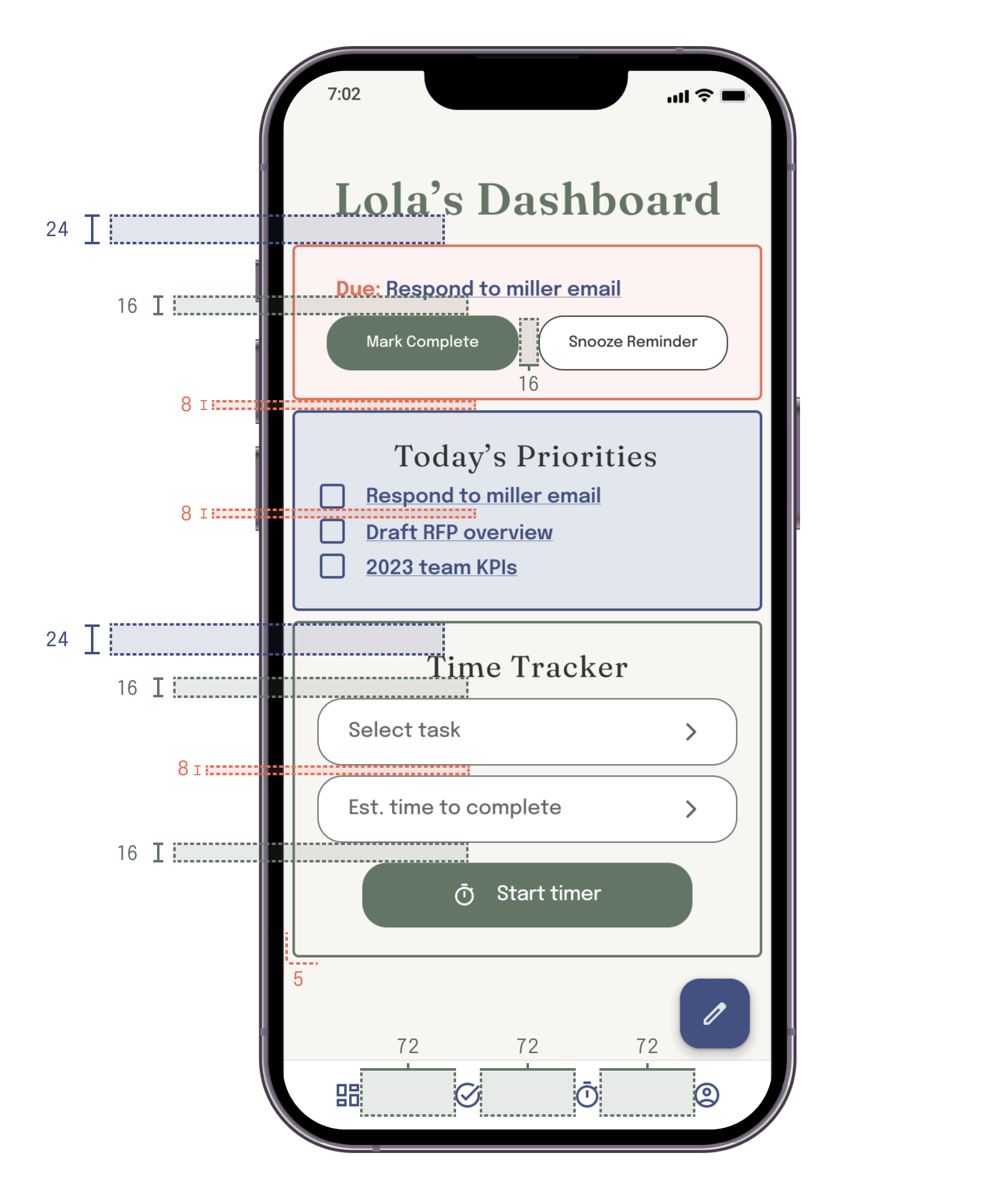
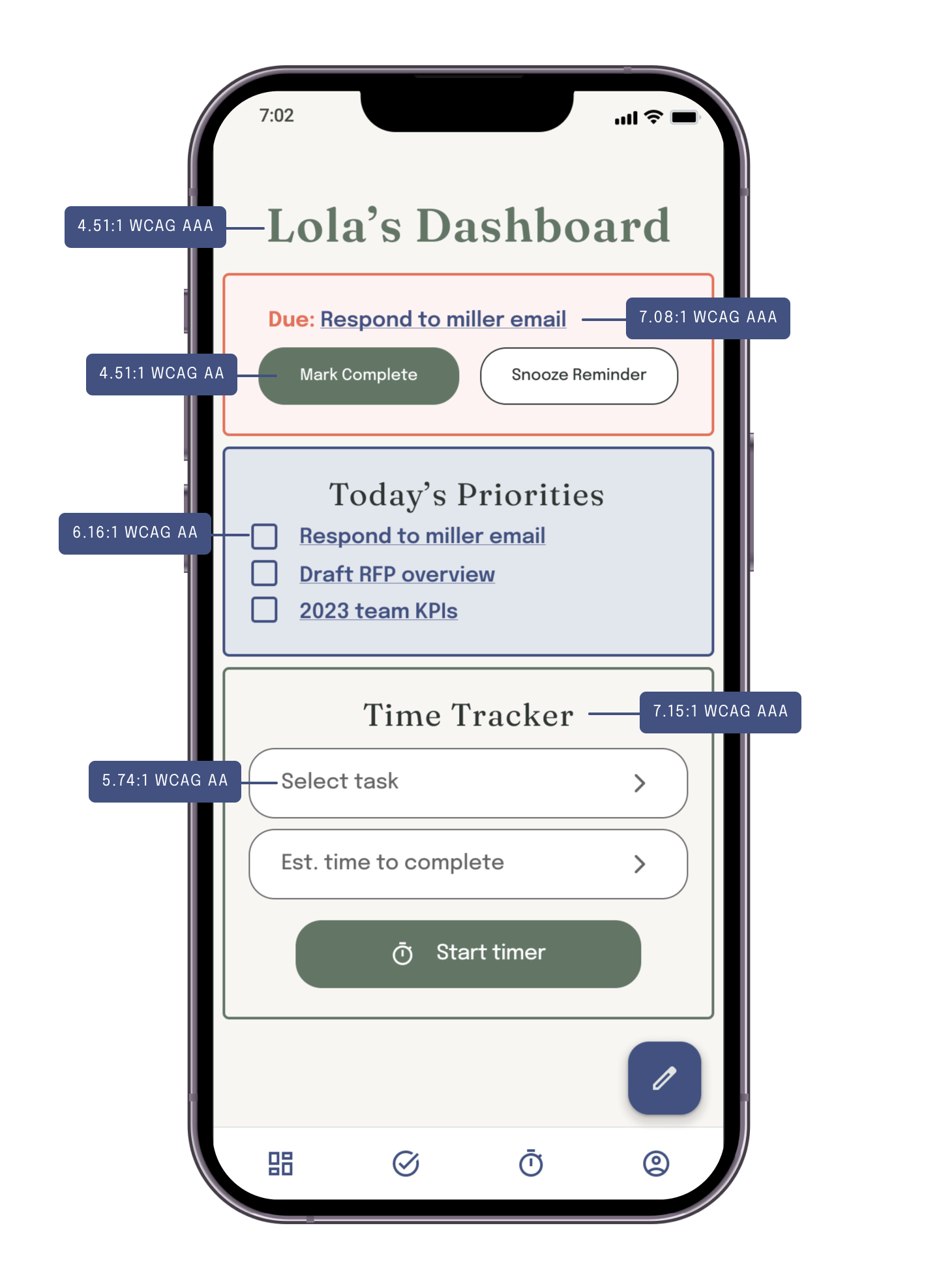
I selected muted colors, with calming greens and blues throughout, to reduce users' anxiety when approaching their task list. I added orange, known to bring out creativity and energy, as an accent to draw attention to the most important notifications.
Fonts were selected to be easily read and hierarchical, and components were nicely rounded to avoid too stark of an interface.
Design decisions
Spacing
High fidelity prototype
I updated the onboarding questionnaire based on user feedback to provide more context. I also added more functionality to the high-fidelity prototype, including the option to add new items as a photo or to add a recurring routine to the calendar.
Please take a look at the complete high-fidelity prototype here.
Accessibility considerations
-
Ensured colors for all text and buttons meet WCAG AA standards for contrast
-
Added alt-text to all images for screen readers to ensure access for users who are visually impaired
-
Buttons on desktop version include a “tab state” for navigating the page with a keyboard and without the use of mouse or touchpad.
Responsive site design
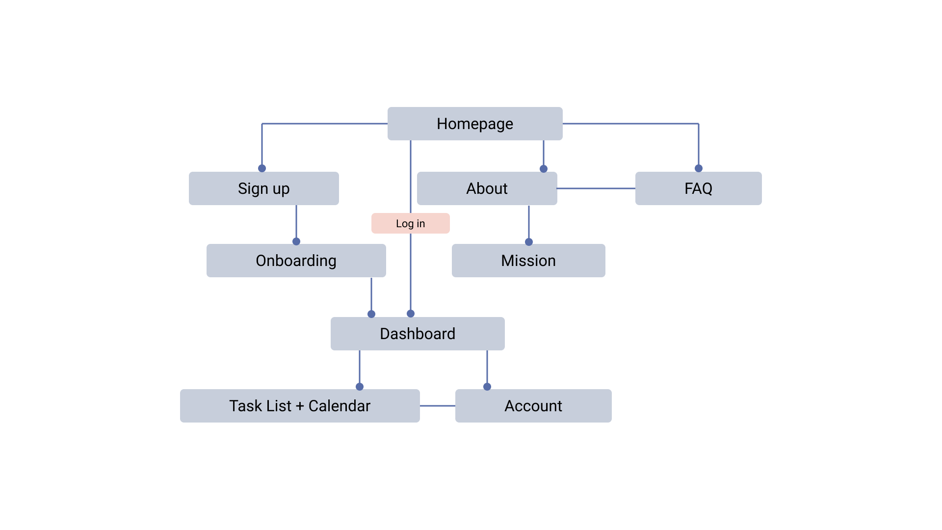
Sitemap
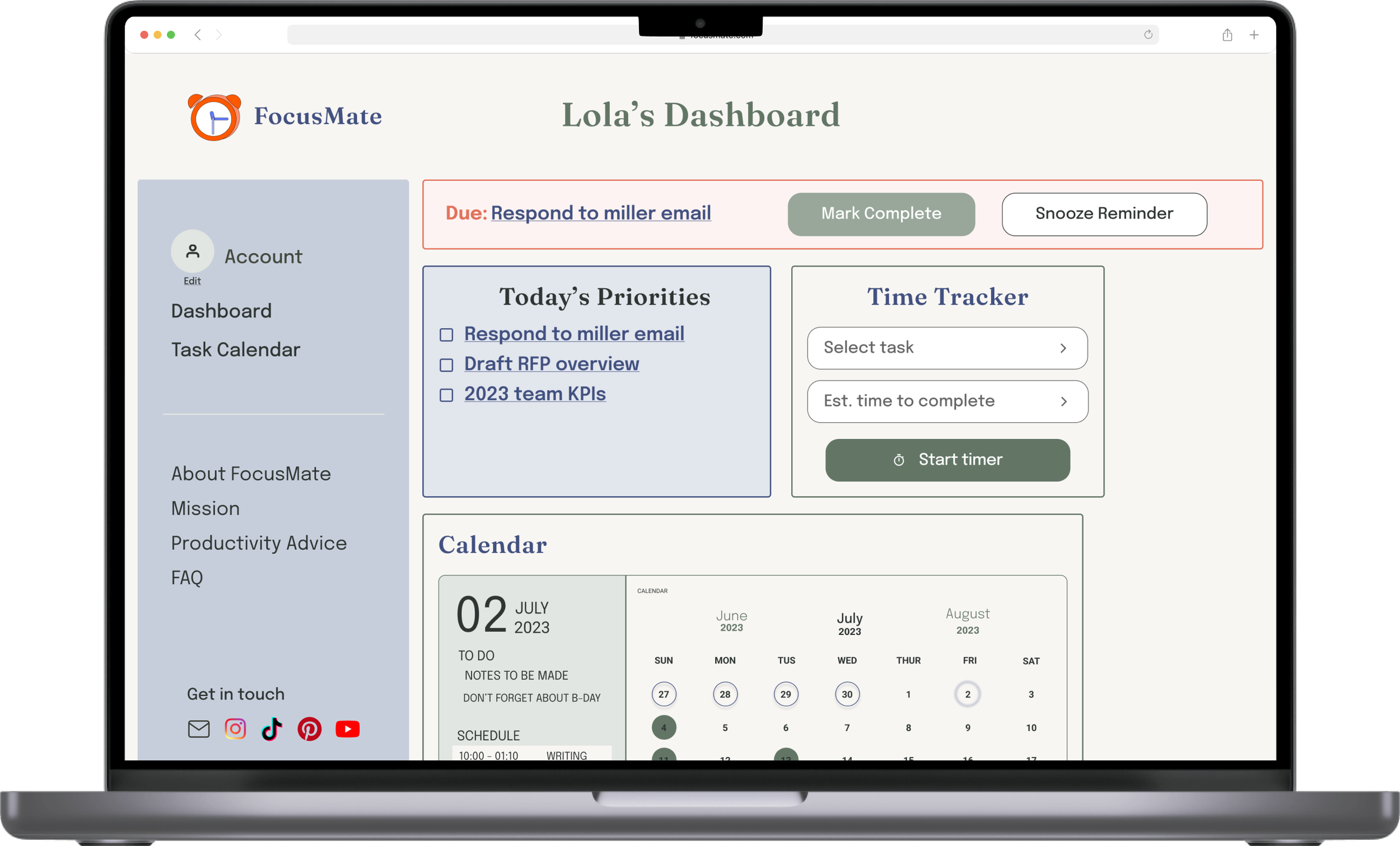
I wanted to include more education about features and how the product was designed for users with ADHD within the mobile and desktop websites. Although our target users will primarily use the mobile app to manage their tasks, I also included a lightweight version of the dashboard and calendar to ensure they can access them wherever they are.
Screen size variations
The designs for screen size variations include mobile, tablet, & desktop. I optimized each to fit specific user needs of each device and screen size.
Learnings & next steps
Creating a product specifically for users with ADHD reinforced the need for robust user research early in the design process. Everything from features, to colors, and layout was influenced by their unique needs.
The FocusMate project has been finalized for now but the following items represent potential next steps, were the project to move forward to launch.
-

Usability study
Conduct additional usability study to validate if the updated design & additional features address user pain points.
-

App Design
Design & prototype secondary pages including calendar and user account page within app.
-

Site design
Design & prototype additional web pages including mission & FAQ.
