Idletime Books Mobile app

Idletime Books is a local bookstore* interested in expanding its customer base with a new mobile app. They offer a wide range of books across categories and formats and cater to busy readers who need more efficient ways to discover & purchase new books.
*Portfolio project
Responsibilities
User research
Paper & digital wireframing
Low- & high-fidelity prototyping
Accounting for accessibility
Iterating on designs
Role
UX designer from conception to delivery
Tool
Figma
Timeline
Sept-Nov 2022

The problem
Busy readers want to efficiently and seamlessly discover, purchase, & start reading new books.
The goal
Design an e-commerce bookstore app that differentiates from major competitors with personalized recommendations and allows users to purchase and read e-books within one app quickly & easily.
Understanding the user
User Pain Points
Before putting pen to paper, I began the design process by conducting interviews and creating empathy maps to understand Idletime’s users and their needs. A primary user group identified through research was working adults who don’t have much time to research new book purchases.
This user group validated a focus on a simple & easy-to-navigate user flow, but research also supported including differentiators like an e-reader feature and personalized book recommendations.
1
Time
Working adults are too busy to spend time researching book recommendations.
2
Functionality
The largest bookstores don’t allow users to directly make digital purchases (e-books and audiobooks) through their apps.
3
Accessibility
Independent bookstores are less likely to integrate book orders with screen readers seamlessly.
Our primary user group is represented by the persona Danika.
Problem statement:
Danika is a busy professional who needs to access books instantly during her commute because she has limited time to read and wants to make the most of her time.
User journey map:
Mapping Danika’s user journey map revealed how helpful it would be for users to order and read e-books within one app.
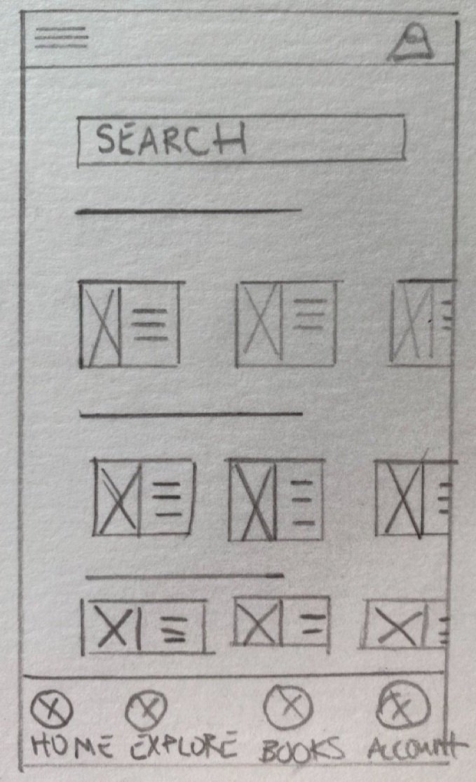
Early designs
Paper wireframes
Starting the design process with paper wireframes allowed me to evaluate multiple homepage layouts and app architecture options quickly.
I prioritized various elements to highlight books (cards, large category images, & carousels) and a robust iconography system to help users make decisions quickly.


Digital wireframes
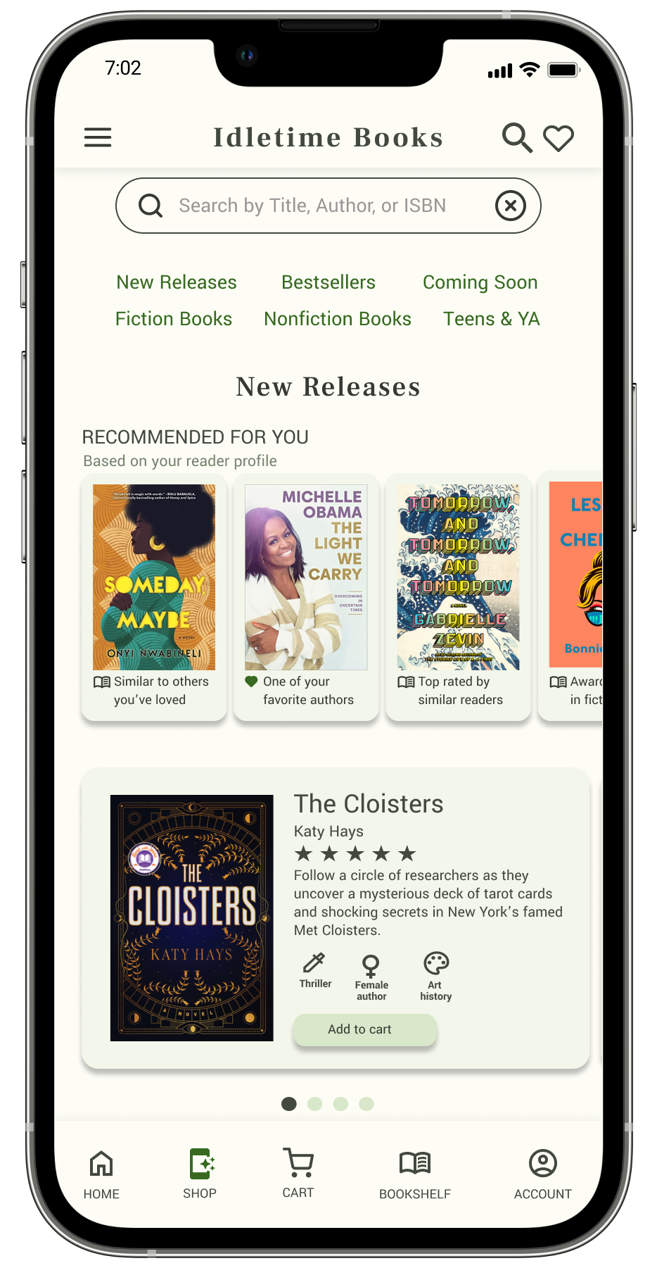
As I moved into digital wireframes, I brought in elements that would help users quickly discover new books since that was a key pain point from the user research.
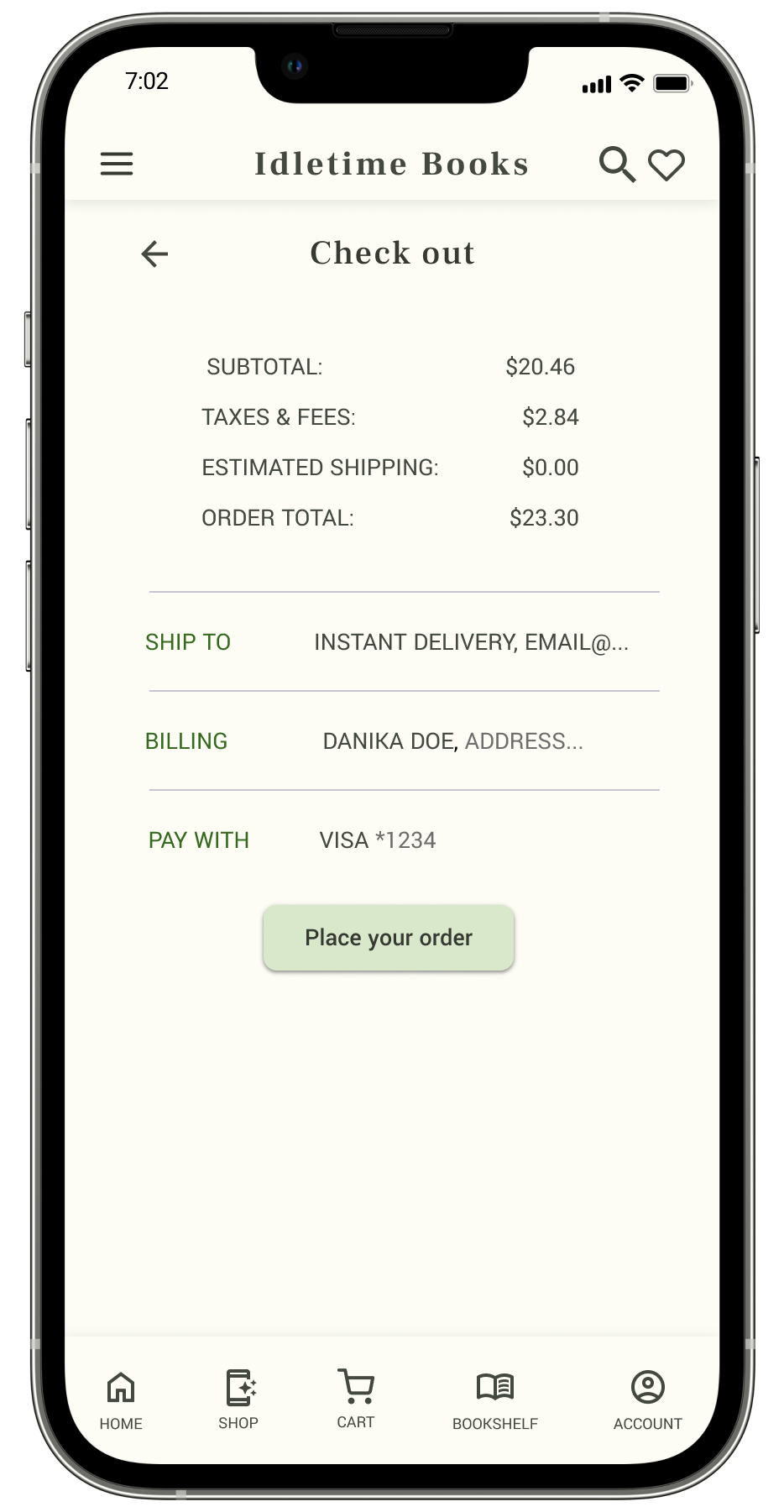
Easy access to download and read digital purchases and a simple checkout process were critical user needs to address in the designs.
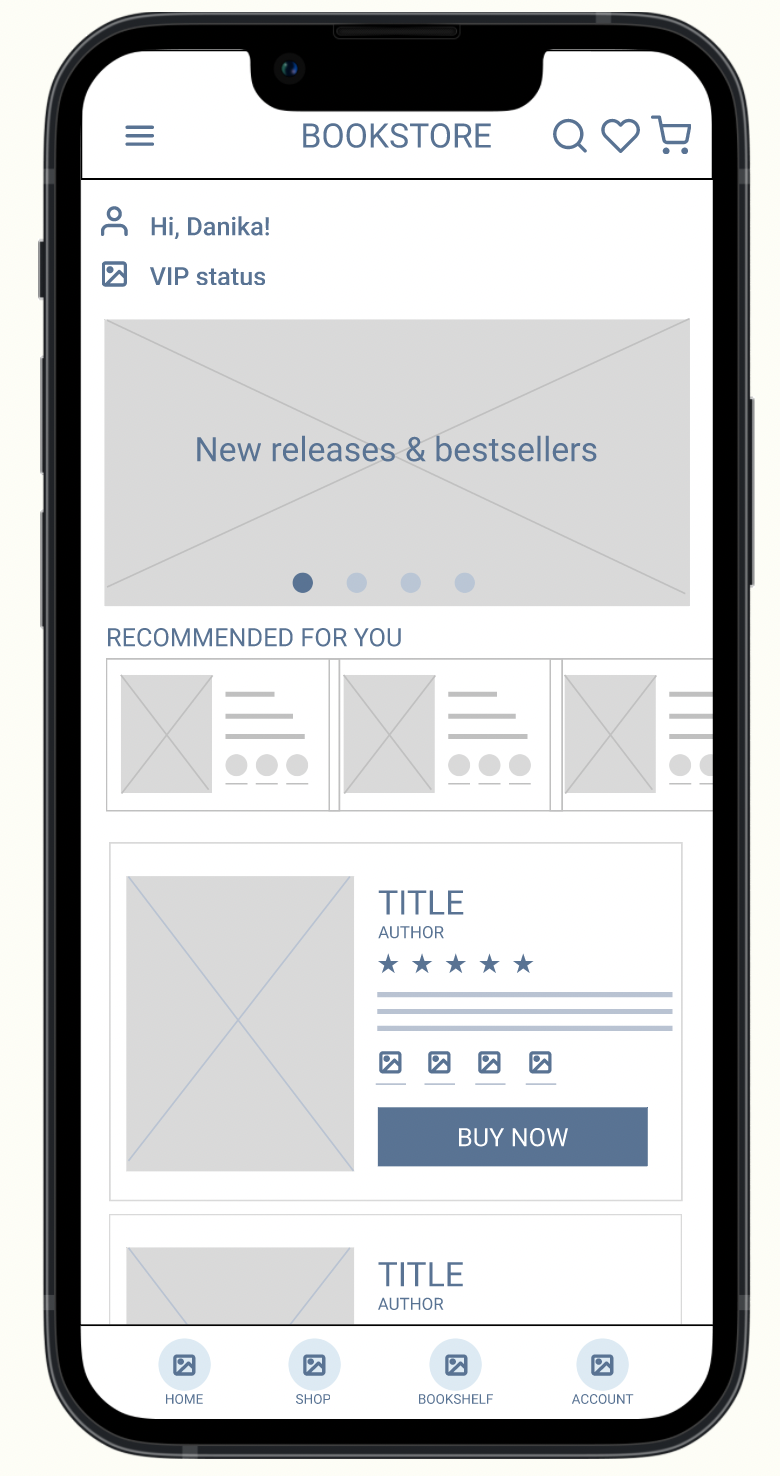
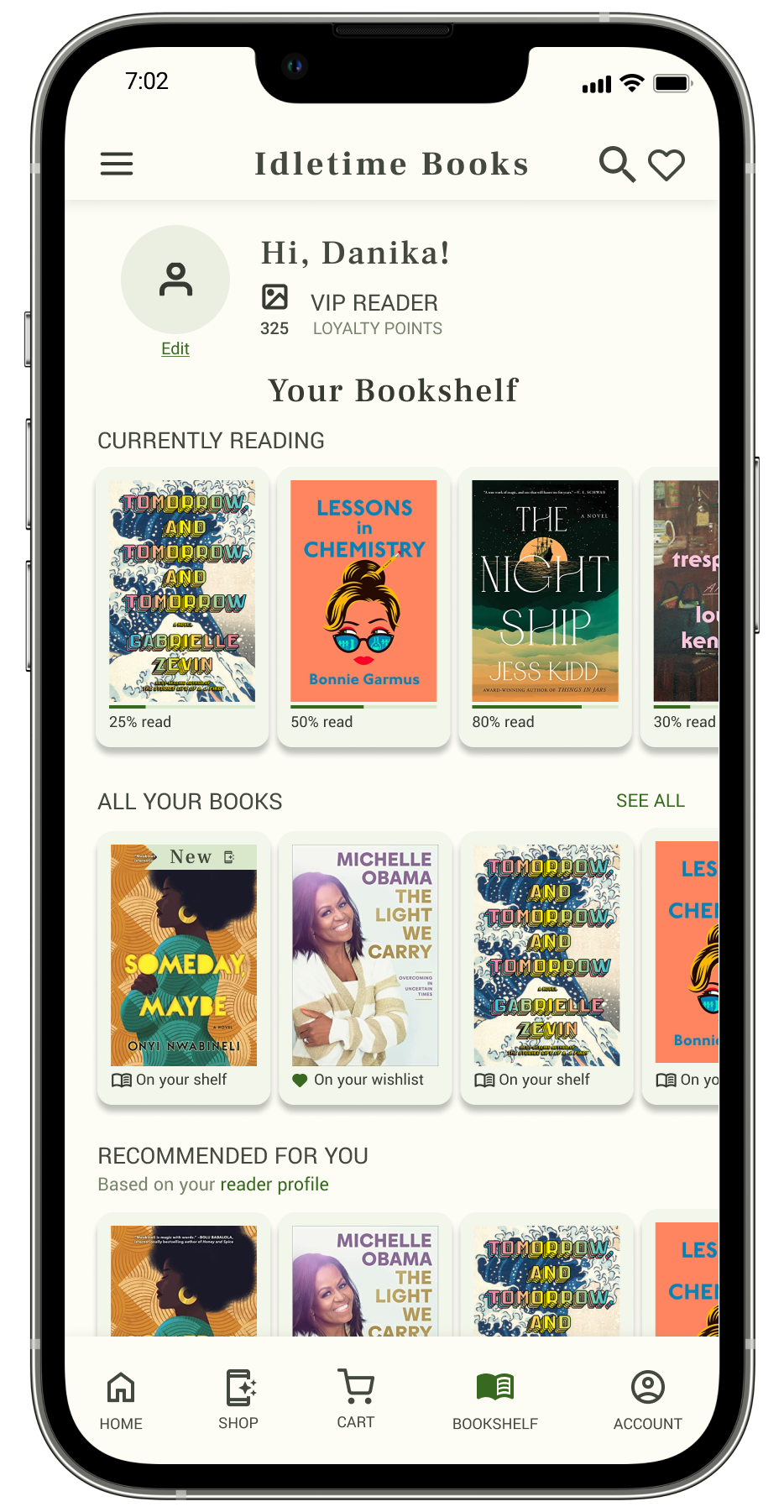
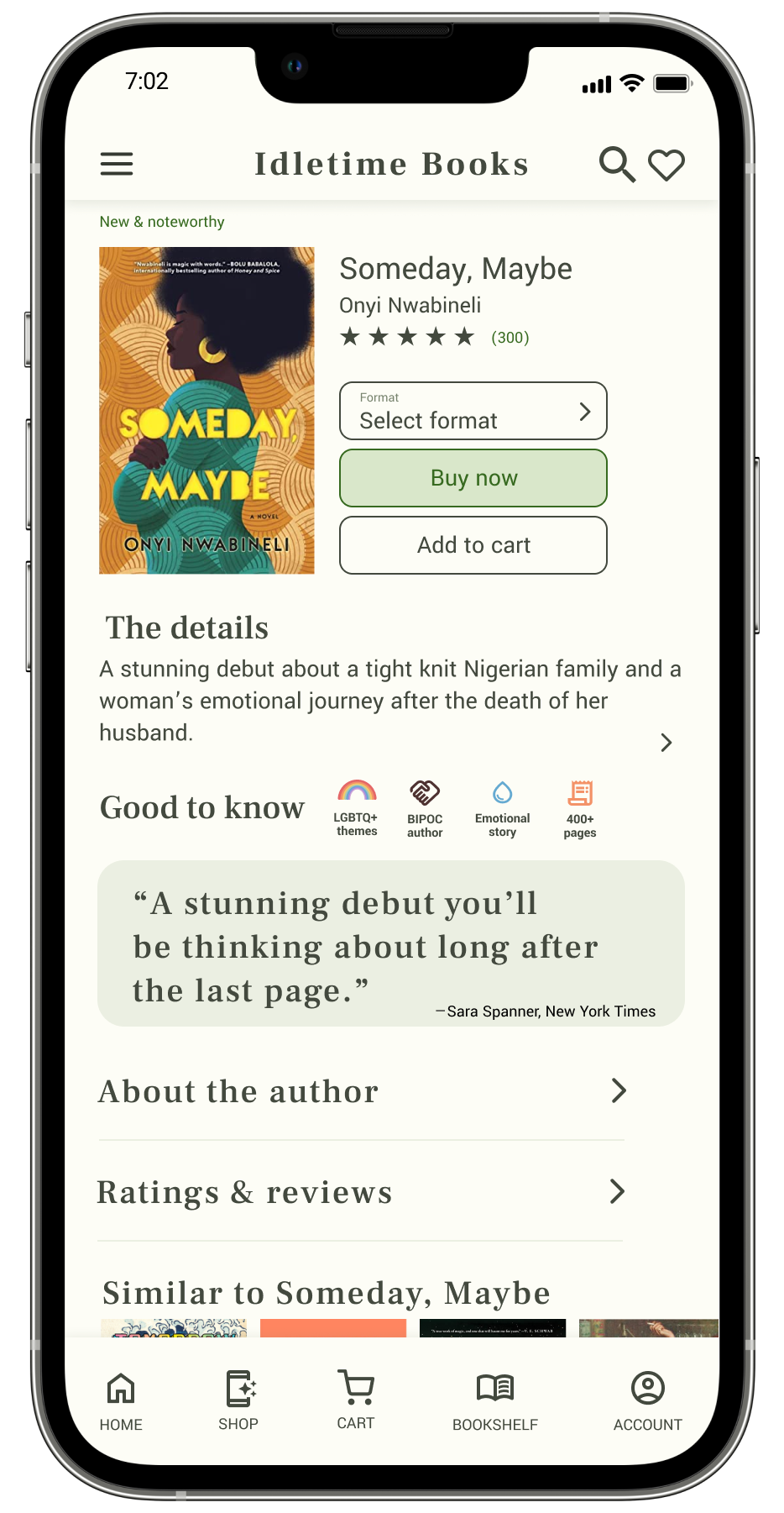
Personalized recommendations allow users to quickly find new books
Description icons highlight key features at-a-glance (ex: award-winning, BIPOC author, topic, etc)
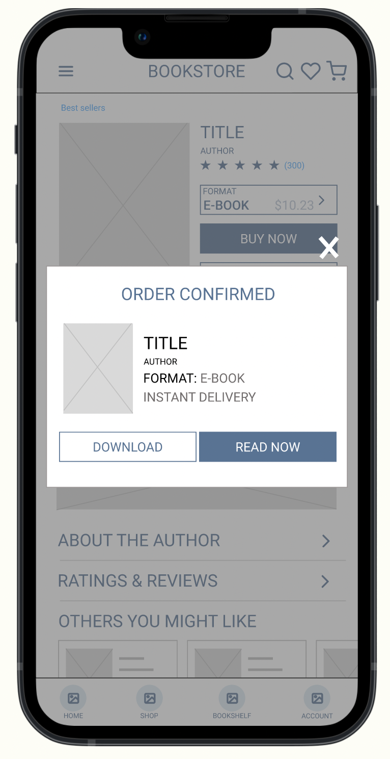
Users are able to take immediate action from the order confirmation
Low-fidelity prototype
The low-fidelity prototype connected the primary user flow of finding, purchasing, and reading a book so the prototype could be used within a usability study.
You can view the Idletime low-fidelity prototype here.
Refining the design
Usability studies
Before transitioning from low-fidelity wireframes to high-fidelity mockups, I conducted the first of two usability studies. The study goal was to determine if the main user flow—discovering and purchasing a book—was easy for users to complete and to learn about any specific challenges users faced in finding new books, buying them, & reading from the Bookshelf feature in the app.
Methodology: Moderated usability study. Participants tested the low-fidelity prototype for our bookstore app.
Participants: 5 users; 2 males & 3 females. Active book purchasers for personal or professional use (purchase more than six books annually).
Finding 1 :
Users were not sure where to find past purchases
4 out of 5 participants weren’t sure where to find their e-book purchases
4 out of 5 participants wanted to access their account page to find past purchases.
Most participants were able to find their e-book purchases on their Bookshelf eventually but expressed confusion
“I want to be able to see purchases in my account. If I paid for it, it's nice to see that clearly.”
V1: No active account page-purchased books viewable in Bookshelf
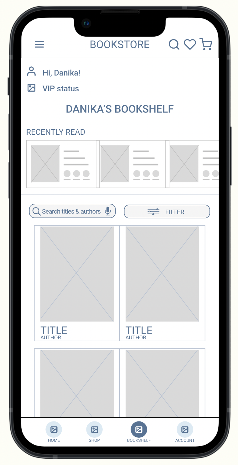
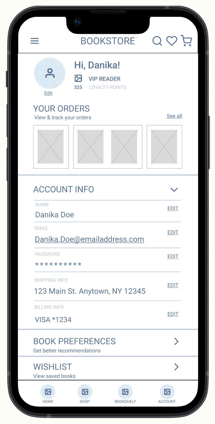
V2: Account page accessible from menu, username, & bottom bar
Finding 2 :
Users need more cues to navigate the bookshelf and read e-books within the app
5 out of 5 participants had some difficulty understanding how to open a book to read once reaching the bookshelf
3 out of 5 participants asked for a “new” or “recent purchases” label on the bookshelf
4 out of 5 participants shared that they liked the bookshelf feature
“That was so easy; it's not like I have to go to my email; it just gave me the confirmation and option to download or start reading right away. I liked that.”
“Wouldn't [the book] just show up? I was hesitating - if I wanted to read it, I would expect it to come up. That should be the default instead of going to the bookshelf.”
V1: Confusing page architecture & multi-steps to “read now”
V2: Read directly from “Read now” without visiting Bookshelf. Updated Bookshelf copy and tags.
Finding 3 :
Users want more book categories & recommendations
3 out of 5 participants suggested additional categories of books they’d like to see.
2 of those participants expressed a desire to see trending & more exciting categories on the homepage
“I would want to see books that are recommended for me in more places. Even if it's the same info in multiple places, having it on my bookshelf would make it feel more custom to me. I almost missed the "recommended for you" on the homepage. That didn't stand out under the much larger "new releases" image.”
V1: limited shopping categories promoted on homepage
V2: Promote more categories & highlight custom recommendations
Final high-fidelity mockups


Accessibility considerations
-
Ensured colors for all text and buttons meet WCAG AAA standards for contrast
-
Added alt-text to all images for screen readers to ensure access for users who are visually impaired
-
Used icons with labels, and large text throughout the app to make navigation easy
Learnings & next steps
Designing the Idletime mobile app taught me the importance of getting user feedback early and often throughout the design process. Feedback on the low-fidelity prototype was critical to evolve the designs as I moved into mockups. Early input on those mockups allowed me to address pain points quickly.
While the Idletime project has been finalized for now, the following items represent potential next steps, were the project to move forward to launch.
-

Design
Design & update supportive features to enhance primary user flow, including personalized reader preferences profile and enhanced product detail page.
-

Usability study
Conduct additional usability study to validate if the updated high-fidelity design addresses user pain points.
-

Iconography
Refine iconography and illustration system