MangiaBene Cooking School

MangiaBene is an online culinary school* offering courses to suit a wide range of skill levels, from beginner to professional. Their goal is to translate the experience and joy of in-person cooking classes into a digital experience accessible to any food lover.
*Portfolio project
Responsibilities
User research
Paper & digital wireframing
Low- & high-fidelity prototyping
Accounting for accessibility
Iterating on designs
Role
UX designer from conception to delivery
Tool
AdobeXD
Timeline
Nov-Dec 2022
The problem
Available online cooking schools don’t offer the hands-on experience and real-time feedback of in-person classes.
The goal
Design interactive lesson quizzes to engage users and improve learning recall.
Understanding the user
User Pain Points
Before putting pen to paper, I began the design process by conducting interviews and creating empathy maps to understand Idletime’s users and their needs. A primary user group identified through research was working parents who don’t have much time to invest in learning new skills.
This user group validated a focus on a flexible, on-demand class schedule, but research also supported creating interactive quizzes that allowed users to receive direct instructor feedback.
1
Hands off experience
Online cooking classes don’t provide an engaging learning experience compared to physical courses that offer hands-on experience.
2
Limited interaction
Video-based online cooking classes don’t offer direct interaction with instructors to ask questions or receive feedback.
3
Inflexible schedule
Online cooking classes often offer an inflexible schedule that makes it difficult for busy adults to participate.
4
Limited offering
They are commonly offered as one-off classes instead of providing a full curriculum and need to be more rigorous for serious students.
The persona Brady represents our primary user group
Problem statement:
Brady is a busy working parent who needs fast, easy classes because he wants to cook healthy meals for his family.
User journey map:
I created a user journey map of Brady’s experience using the site to help identify possible pain points and areas of opportunity. Mapping Brady’s user journey map revealed how important it would be to keep the quiz engaging throughout to avoid losing users’ attention.
Early designs
Sitemap
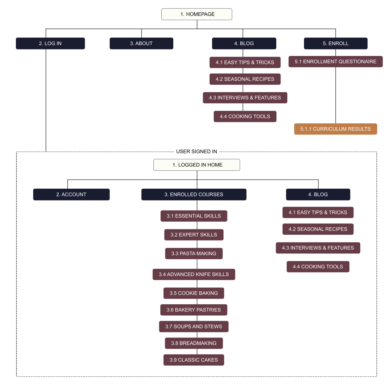
My goal was to create a simple yet content-rich information architecture to engage users quickly.
I chose a hierarchical overall website structure and a linear structure within classes.
Paper wireframes

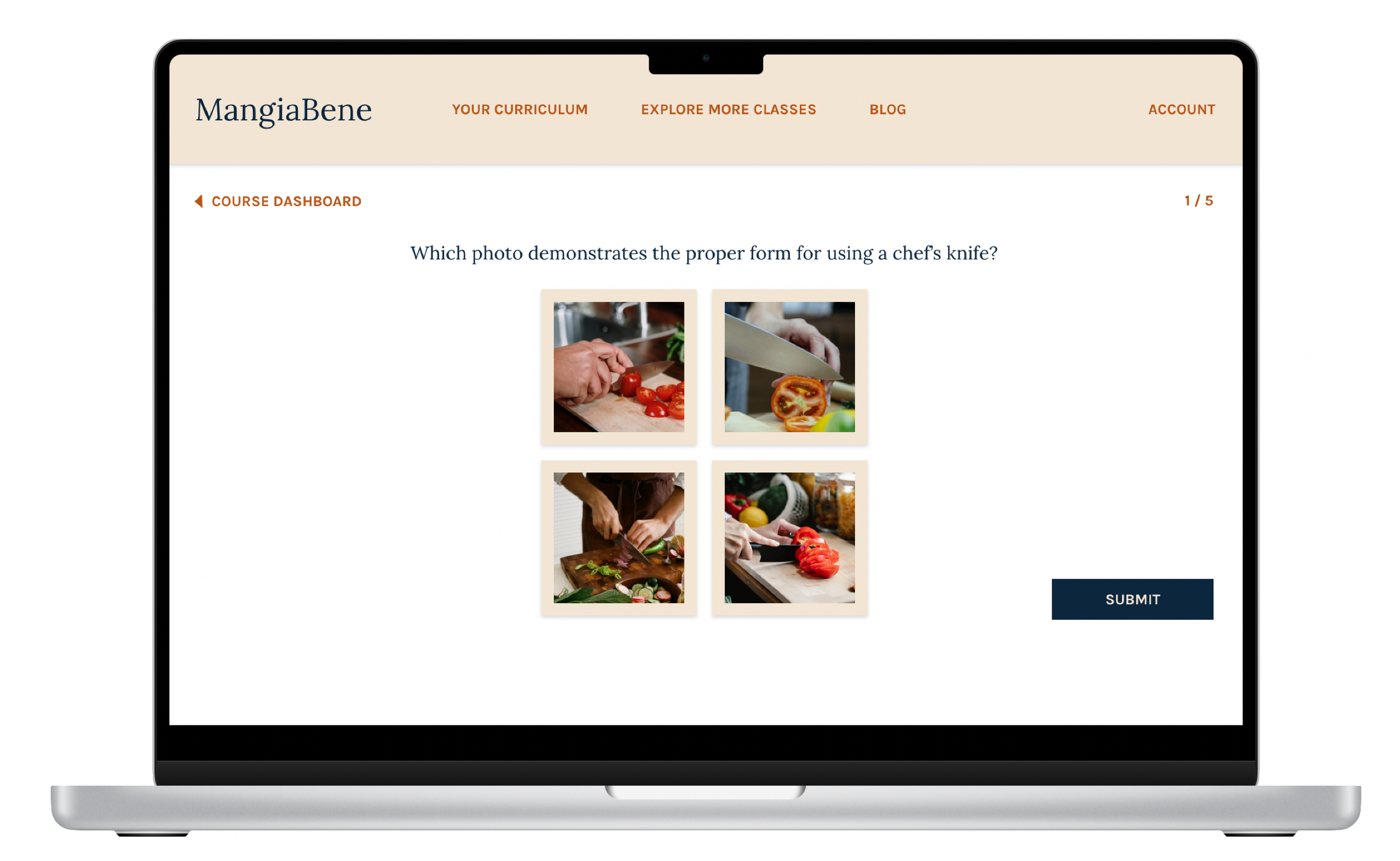
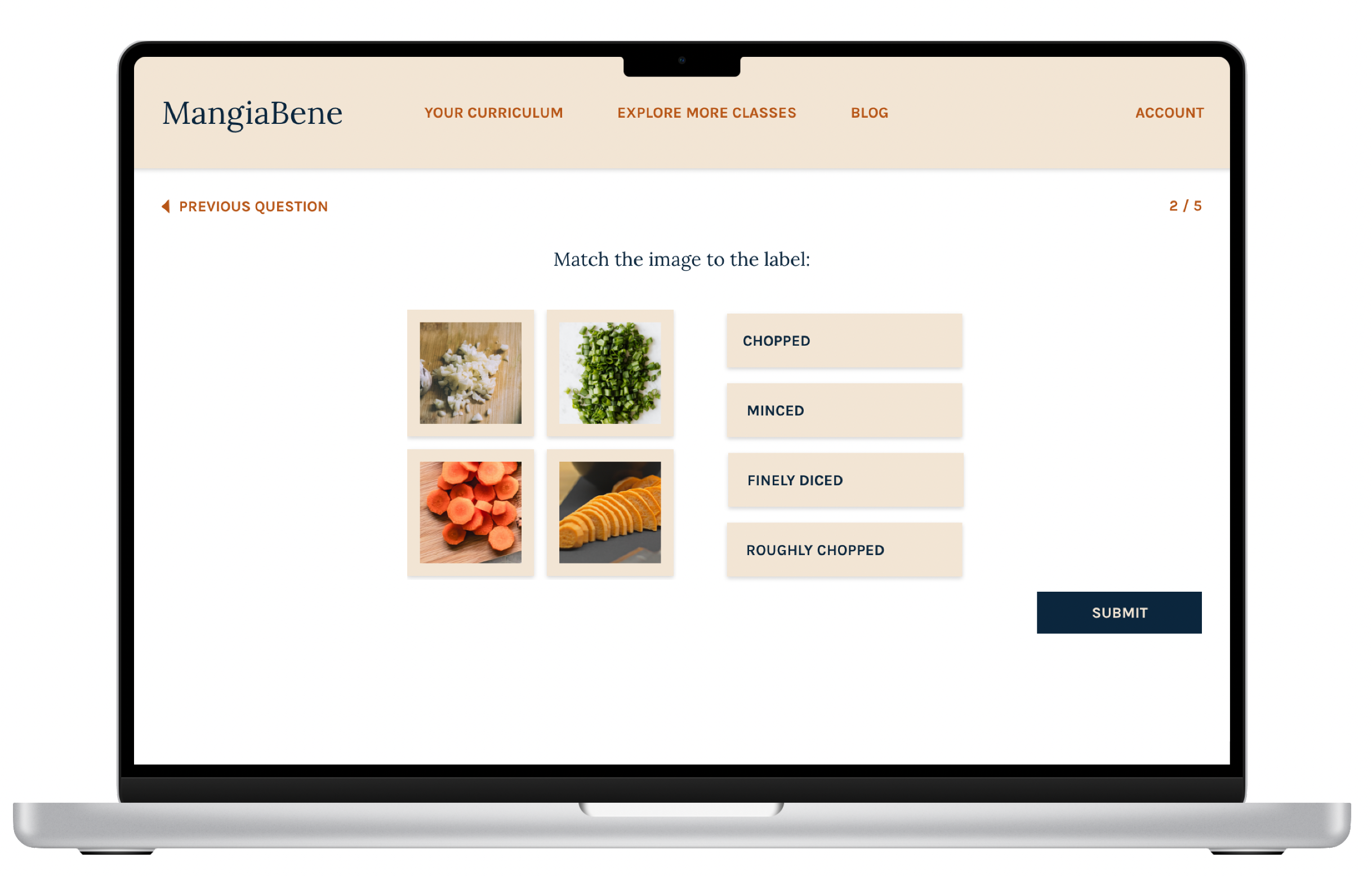
My goal for paper wireframes was to establish a simple quiz framework that would translate well within smaller screens and keep users engaged.
As a result, I rejected early options that included multiple questions within one screen and took inspiration from mobile learning apps like Duolingo.
Digital wireframes

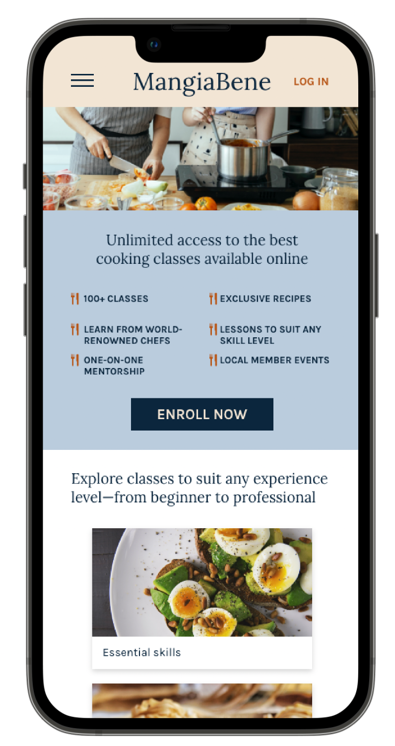
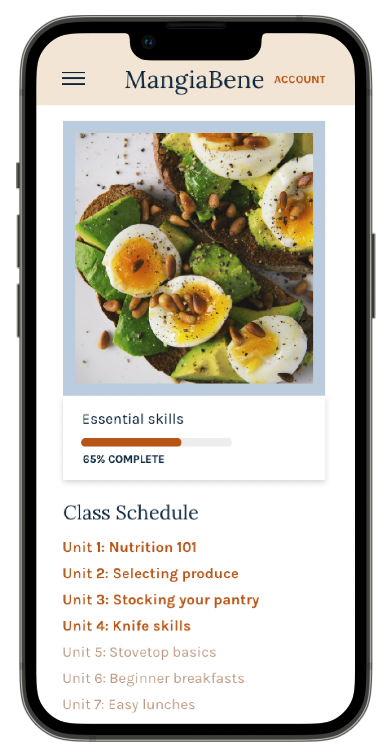
As I transitioned to digital wireframes for the homepage, I added content details, designed a set of cards to aid in visually separating each section, and established a typographic hierarchy.
Visual cards for additional courses align with best practices from other online cooking courses
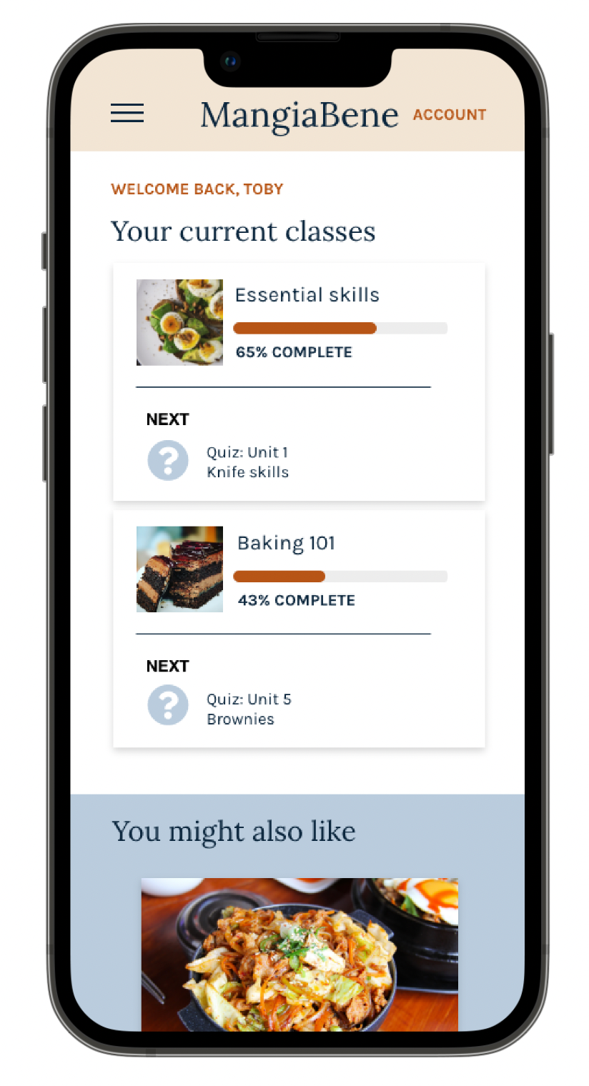
Current courses are front and center for returning users
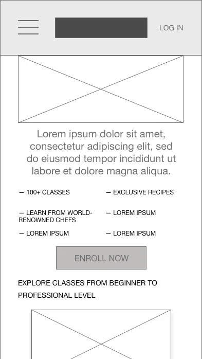
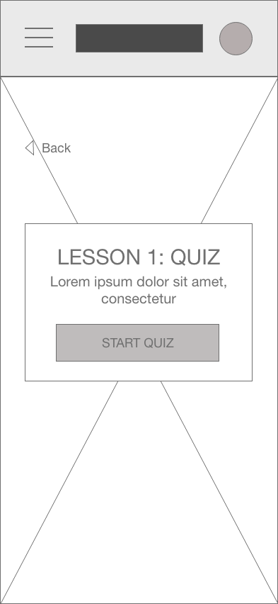
I utilized a tiered layer cake layout for the desktop versions of the logged-out and logged-in homepage to easily transition to a single-column layout for the mobile version and a featured image layout for the lesson.
Digital wireframe screen size variations
Logged out homepage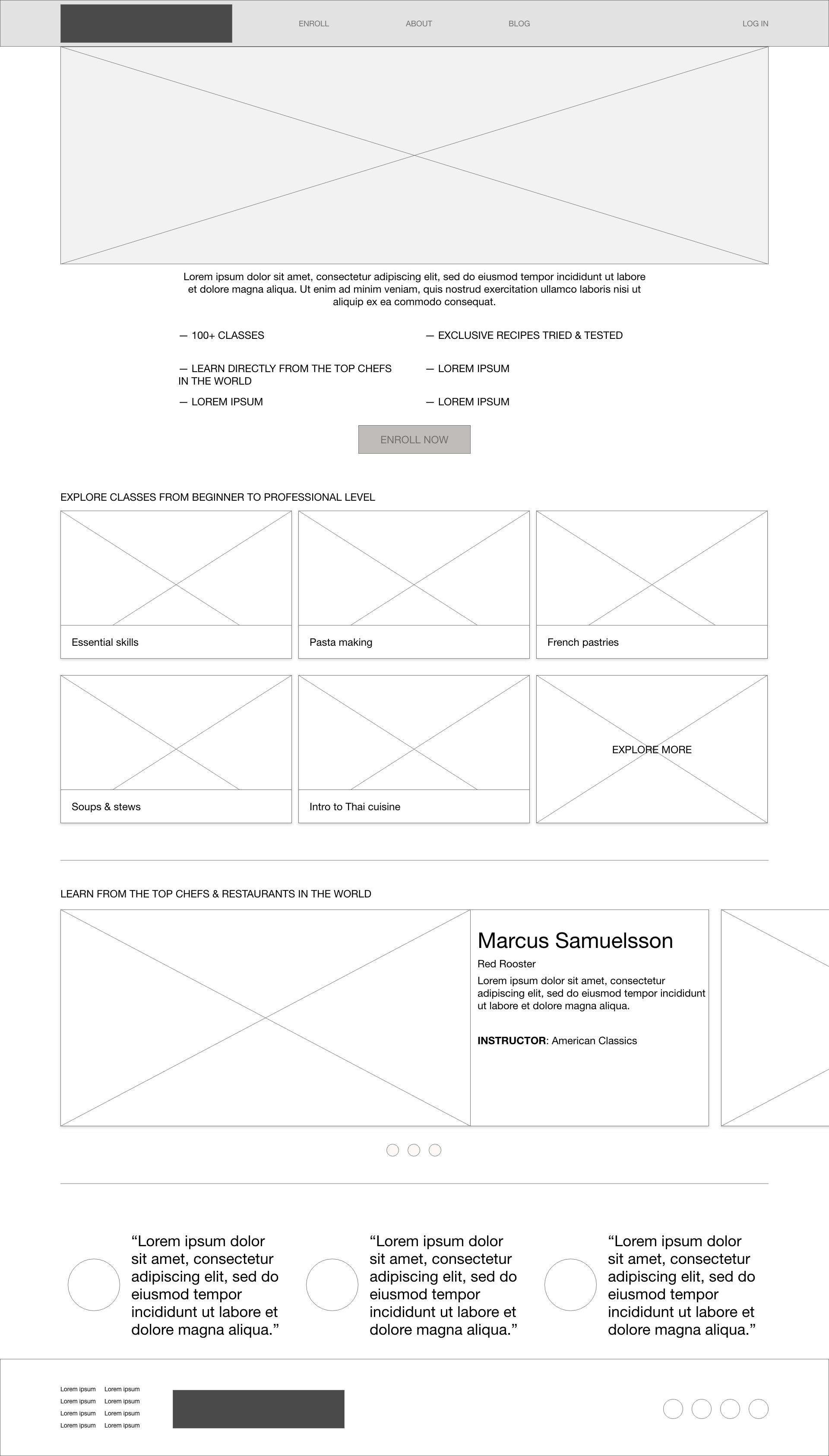
Logged in homepage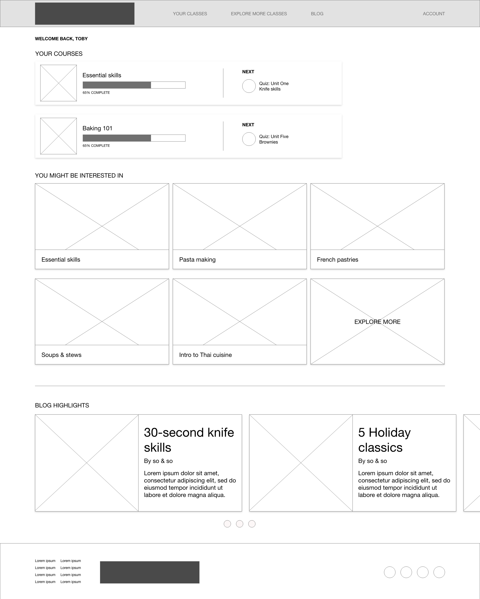

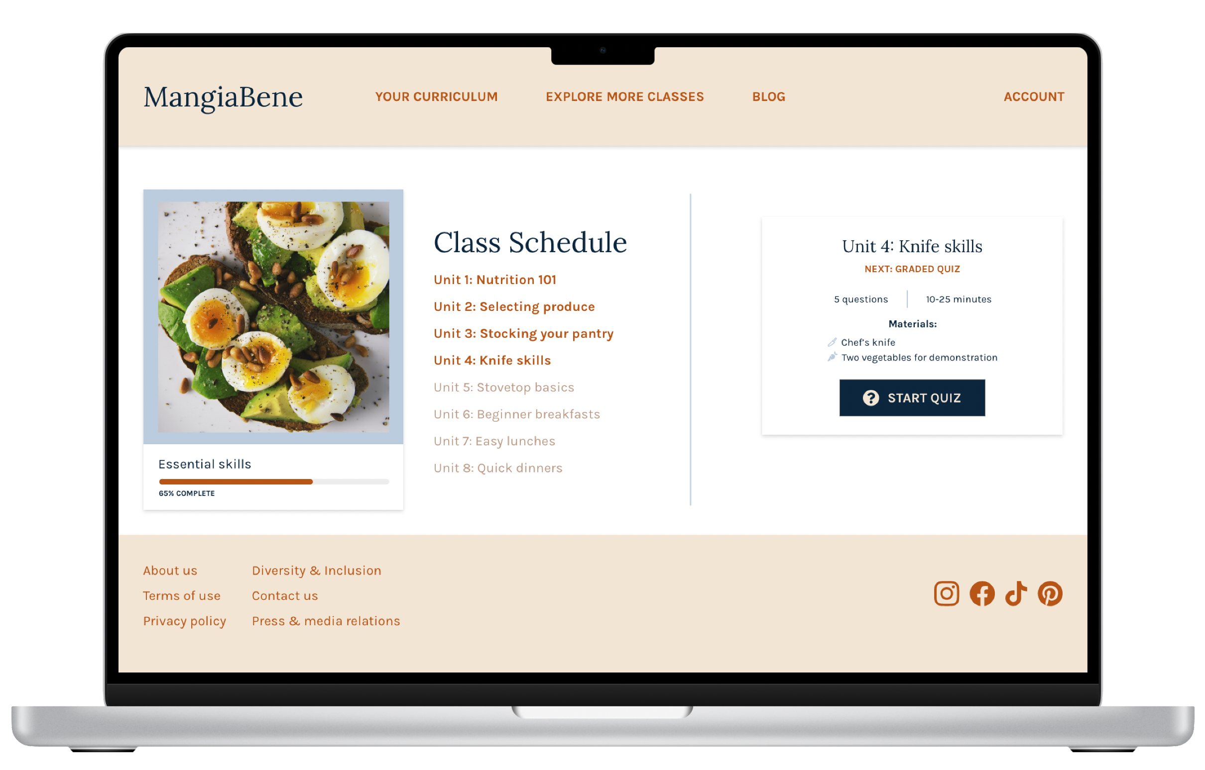
Quiz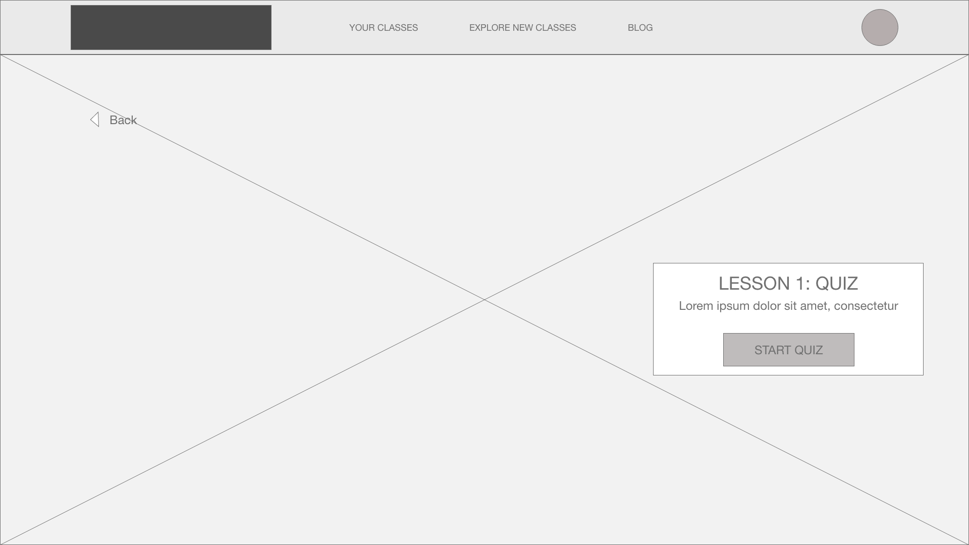
Refining the design
Usability studies
Before transitioning from low-fidelity wireframes to high-fidelity mockups, I conducted a usability study. The study goal was to determine if the flow of taking a quiz as part of a course lesson was accessible and engaging for users to complete.
Methodology: Moderated usability study. Participants tested the low-fidelity prototype of the MangiaBene website.
Participants: 5 users; 1 male & 4 females
The usability study revealed the need for more context to transition users from their logged-in homepage to their class in progress and a more interactive lesson experience to address user pain points.
Learnings
-

Course content
Users needed clarification on jumping directly into the course quiz from the logged-in homepage and expected to see more class details as a returning user.
-

Interactive experience
Users needed more interactivity within the quiz. They noted they expected some signal that an answer was selected before submitting and more variety of question format.
-

Feedback & learning
Users were frustrated with the lack of feedback or interaction with an instructor and no opportunity to review the questions they answered during the quiz.
Interactivity
Users expected a more interactive experience, including indicating that an answer was selected within the quiz. I added hover and pressed states for each button within the prototype to address this.
Before usability study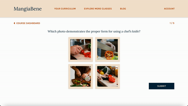
After usability study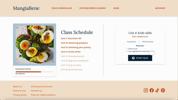
Feedback & learning
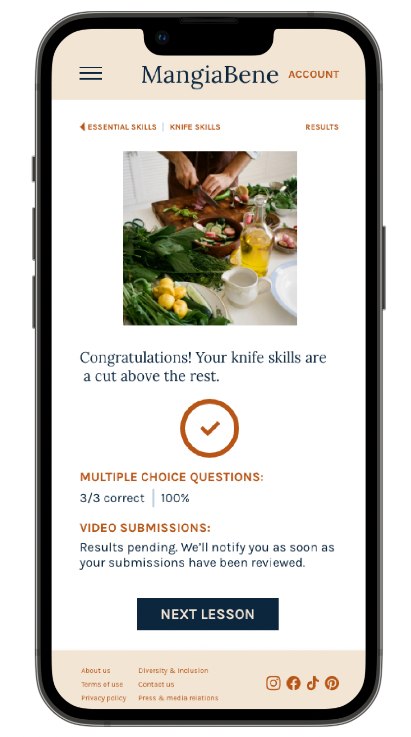
To address users concerns about a lack of real-time feedback on lessons, I added a pop-out section on the results page, providing further context on each answer.
Before usability study
After usability study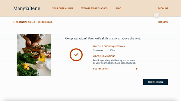

Accessibility considerations
-
Ensured colors for all text and buttons meet WCAG AAA standards for contrast
-
Added alt-text to all images for screen readers to ensure access for users who are visually impaired
-
Buttons include a “tab state” for navigating the quiz with a keyboard and without the use of mouse or touchpad.
Learnings & next steps
This project is the first responsive site I’ve designed as part of a UX design certificate program. I designed top-down (graceful degradation) to address the desktop version of the website before mobile. It was a fun learning process to balance filling the space (so much space!) while also planning for a consistent mobile experience and keeping the design from feeling cluttered in either size. Ultimately, I prefer progressive enhancement design & a mobile-first approach to graceful degradation.
I decided to focus on designing a short lesson quiz over a more traditional primary user flow like a signup or subscription checkout because I wanted to expand my ability to create an interactive experience. While I found many competitive references to guide the design of the cooking school homepage, creating a quiz required me to get a bit more creative. I pulled inspiration from class setup & quizzes on Coursera, the Prose consultation, and learning apps like Duolingo. Duolingo, in particular, pushed me to design various question structures to keep the examination as engaging as possible. Designing for desktop also allowed me to push my use of different button states, including hover, tab, & pressed throughout the quiz.
I’m looking forward to exploring much more interactivity within my designs.
Finally, MangiaBene was designed 100% in AdobeXD, a new tool for me. While my preferred design tool is Figma, I enjoyed learning AdobeXD’s nuances and functionality.
The MangiaBene project has been finalized for now, but the following items represent potential next steps, were the project to move forward to launch.
Next steps
-

Design
Design & prototype further lesson structures, course catalog page, & course subscription flow.
-

Usability study
Conduct additional usability study to measure the effectiveness of the homepage & course subscription flow to drive conversion.
-

Research
Research to evaluate the benefits and feasibility of an accompanying mobile app.